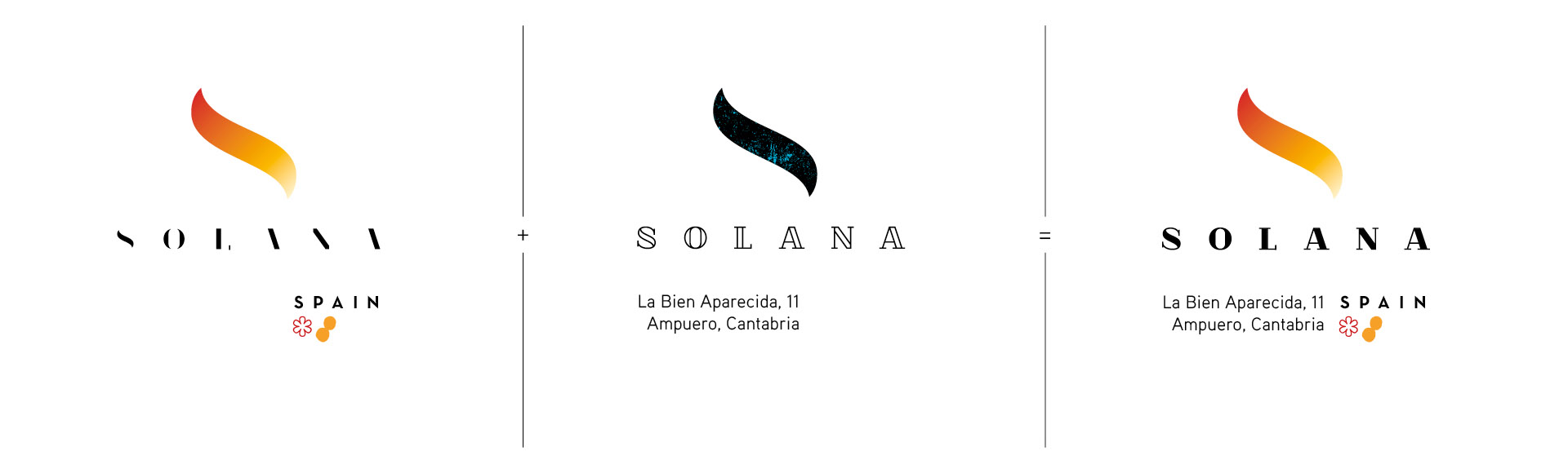
For the development of the brand we opted for an unusual solution in corporate identity, and that was the creation of a multiple logo, where the more sophisticated version for the restaurant, with a very marked minimalist look, fits with the graphics applied in the traditional bar. The union of the two forms the generic brand logo, which tries to look to the past and the future, and which tries to be traditional and sophisticated at the same time.
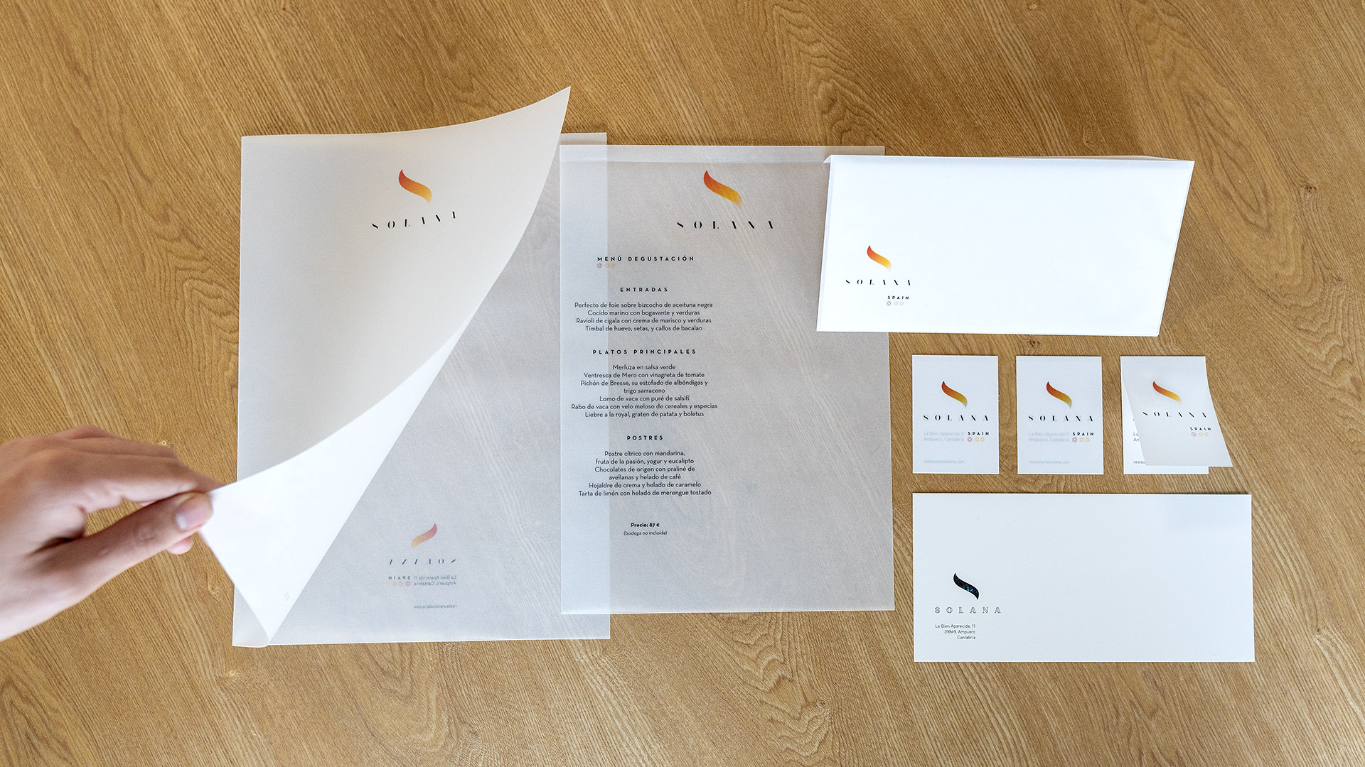
The development of the brand aims to emphasize this modular approach, and again using unconventional solutions, the stationery was printed on translucent paper, which allows the cards, envelopes and subfolders to show, in a set of transparencies, all the shapes of the brand.